


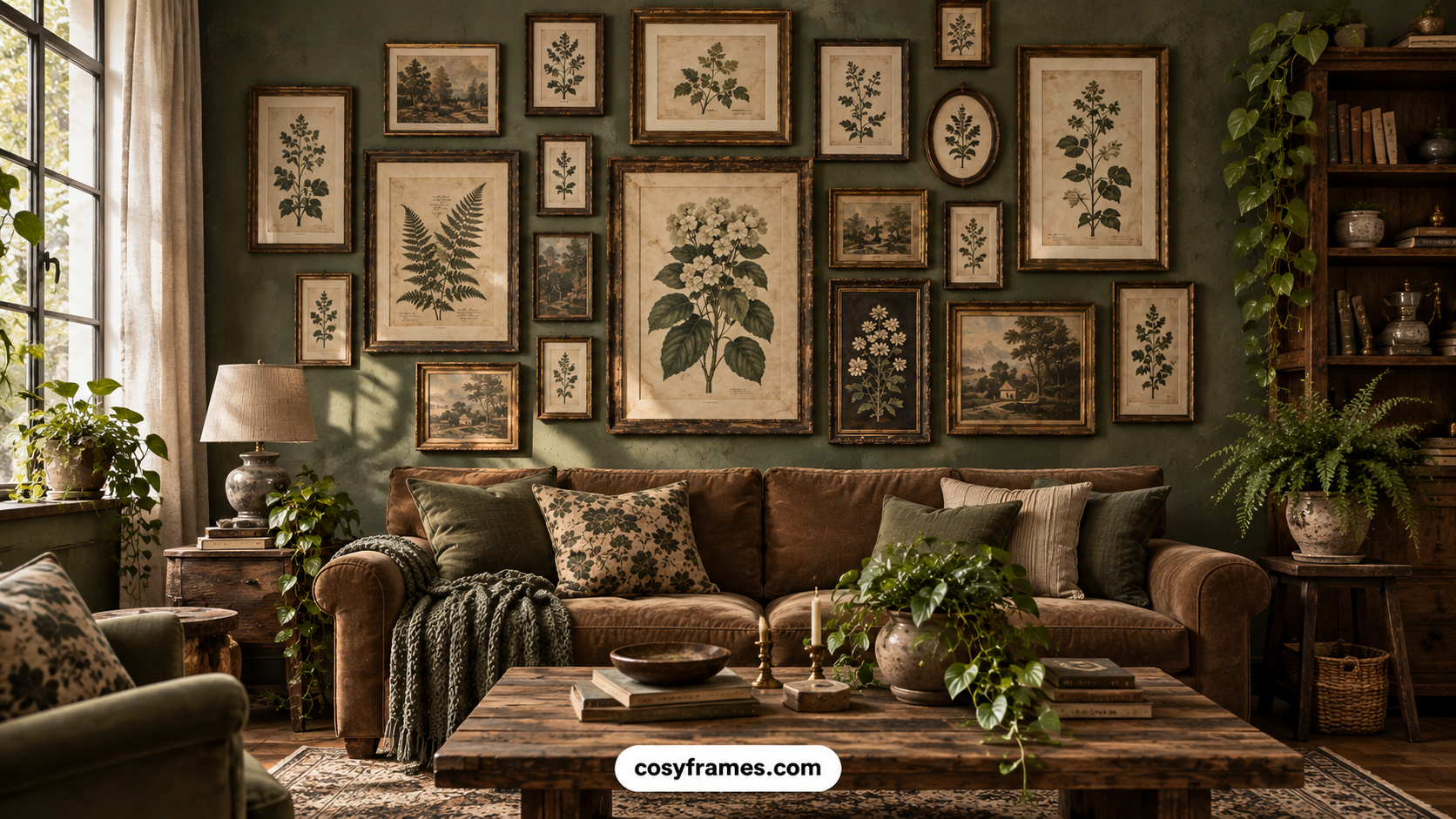
There’s a reason vintage botanical prints keep showing up in every cozy home tour you save. They do something most wall art can’t: they feel collected, not decorated. A gallery wall full of antique leaves, pressed ferns, and hand-drawn florals looks like it’s been in the family for generations, even if you ordered the whole set last week.
If you’ve been searching for vintage botanical gallery wall ideas, you’re probably after the same thing most of us are a home that feels warm, layered, and personal without looking like a showroom. That’s exactly what this style delivers. It’s affordable, endlessly customizable, and works in almost every room in the house, from a moody staircase to a sun-drenched reading nook.
Below are 25 vintage botanical gallery wall ideas you can pull inspiration from, plus practical styling advice, room-by-room recommendations, and the mistakes to avoid so your wall looks intentional instead of cluttered. Save this one to Pinterest you’ll want to come back to it while you’re planning.
Why This Style Is Trending
Vintage botanical decor sits at the intersection of two things everyone wants right now: cottagecore-adjacent coziness and old-money, “quiet luxury” restraint. It’s earthy without being rustic, elegant without being formal. Botanical illustrations have been used in homes for centuries think English manor libraries and French countryside kitchens so the look never actually feels trendy. It feels timeless.
There’s also a practical reason this style is everywhere on Pinterest right now: botanical gallery walls photograph beautifully. The mix of muted greens, soft creams, and aged paper tones creates a warm, editorial look that performs well whether you’re styling a living room for a listing photo or just want a corner of your home that feels like a page out of a design magazine.
Add in the fact that neutral, nature-inspired interiors have dominated home decor for the past few years, and it makes sense that vintage botanicals with their soft palettes and organic shapes have become one of the most-saved wall art categories on Pinterest.
Benefits of Using Vintage Botanical Prints
Before we get to the ideas, it’s worth understanding why this style works so well in real homes, not just in photos.
- They go with almost everything. Vintage botanicals pair naturally with English country decor, farmhouse interiors, coastal grandmother spaces, and even modern minimalist rooms, because the color palette stays neutral while the subject matter adds warmth.
- They create instant coziness. Botanical illustrations reference the outdoors without requiring live plants, so you get that grounded, nature-connected feeling even in a north-facing room with no natural light.
- A coordinated print set does the design work for you. Instead of hunting for individual pieces that happen to match, a curated botanical gallery wall collection is pre-sized, pre-toned, and framed to work together — which takes the guesswork out of the hardest part of any gallery wall: getting the mix right.
- They’re budget-friendly. Many botanical illustrations are public domain, which means high-quality reproductions are widely available at a fraction of the cost of original art.
- They age well. Because the prints already look aged, they don’t go out of style the way trend-driven art does.
25 Vintage Botanical Gallery Wall Ideas
1. Classic Black-and-White Botanical Engravings
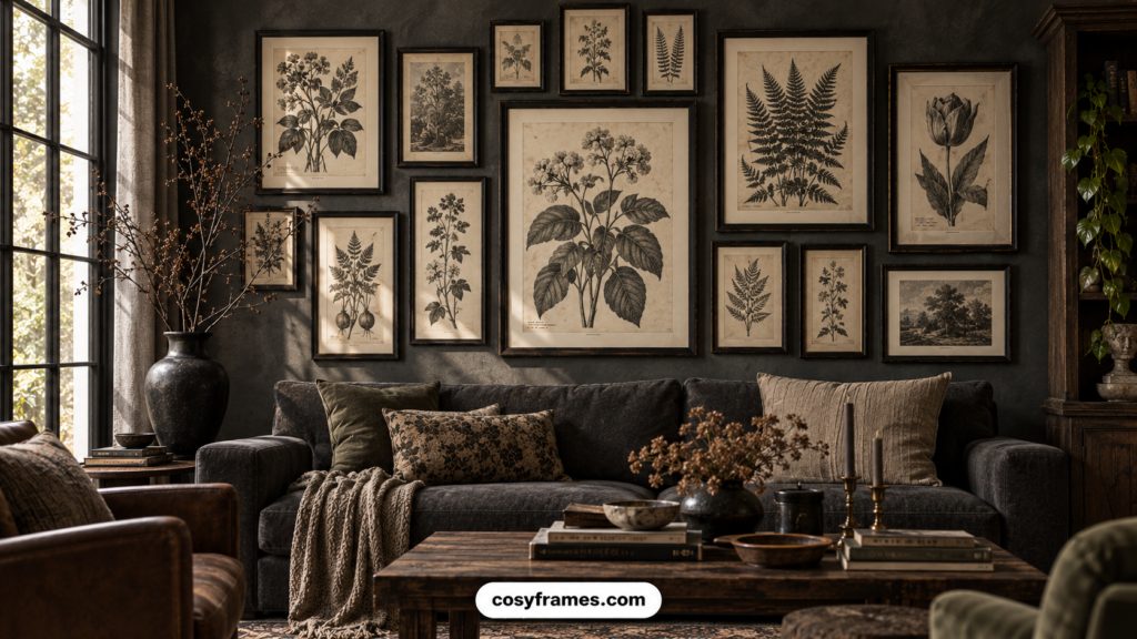
Start with the most timeless option on this list. Black-and-white botanical engravings the kind pulled from old scientific journals bring instant sophistication to a wall without adding color competition. Frame them in slim black or antique brass and arrange them in a tight grid above a console table or sofa. This works especially well in a room with warm wood tones, since the high-contrast prints add crispness without fighting the furniture. It’s a foolproof starting point if you’re nervous about mixing too many botanical styles at once.
2. Sepia-Toned Antique Herbarium Sheets
Herbarium sheets the pressed-plant specimens botanists once mounted with handwritten labels make one of the most collected-looking gallery walls you can create. The soft sepia and cream tones feel like they belong in an old greenhouse. Hang them in mismatched thin wood frames across a stairwell or hallway for a layout that feels discovered rather than designed. Pair with brass picture lights for an extra touch of old-world charm, and let the handwriting details on each sheet become a quiet conversation piece.
3. Watercolor Wildflower Bouquets
For a softer, more romantic feel, look for vintage watercolor illustrations of loose wildflower bouquets think cottage garden blooms in dusty pink, sage, and butter yellow. These work beautifully in a bedroom or reading nook, layered above a bench or bed frame in a loose, asymmetrical cluster. The watercolor softness keeps the wall feeling airy rather than heavy, which makes this one of the best options if your room already has a lot going on texturally, like linen bedding or a woven rug.
4. French Botanical Illustrations With Gold Frames
Channel a French countryside kitchen with botanical illustrations labeled in French script, framed in thin, warm-gold frames. This pairing feels elevated without trying too hard it’s the print style you’d expect to see in a Provence farmhouse or a Parisian apartment. Hang a set of six to eight in a symmetrical grid above a dining table or sideboard for a look that reads as collected over years of travel, even if the whole set came from one curated collection.
5. English Cottage Garden Florals
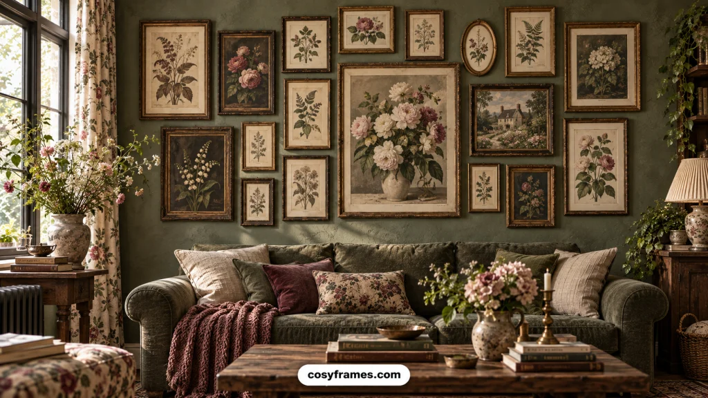
This idea leans fully into English country decor: dense, layered floral illustrations in rich greens, burgundy, and navy, framed in dark wood or aged gilt. Cluster them in an irregular, salon-style arrangement that fills a large stretch of wall this is one style where more really is more. It’s especially striking in a living room with deep, saturated wall paint, where the botanical prints add texture and history rather than getting lost against a plain white background.
6. Pressed Fern Prints in Brass Frames
Ferns bring a quieter, more architectural energy than florals, which makes them a great choice for a room that needs botanical warmth without visual noise. Look for vintage fern illustrations with delicate linework, and frame them uniformly in slim brass. A clean, evenly spaced row works well above a headboard or sofa, giving the wall a calm, orderly rhythm that still feels organic. This is a great entry point if you want the botanical look but prefer a more minimal, editorial arrangement.
7. Vintage Seed Packet Art Wall
Old seed packet illustrations the kind with bold typography and stylized produce or flowers add a playful, slightly graphic twist to the vintage botanical trend. They’re especially at home in a kitchen or breakfast nook. Frame a mixed set in simple black frames and hang them in a loose grid near open shelving or a window. The combination of illustration and vintage typography gives this idea more personality than a purely botanical print, while still fitting the same cozy, collected aesthetic.
8. Mushroom and Fungi Botanical Prints
Mushroom illustrations have quietly become one of the most-saved botanical subcategories on Pinterest, and for good reason they bring a cottagecore, forest-floor warmth that florals alone can’t. Choose antique mycology illustrations in muted browns and creams, and mix them into a gallery wall alongside fern or leaf prints for variety. This works particularly well in an entryway or powder room, where a slightly unexpected subject gives guests something to notice and comment on.
9. Tropical Palm Leaf Vintage Illustrations
If your home leans more global or colonial-revival in style, vintage palm and tropical leaf illustrations offer a botanical option with a bit more drama. Look for large-scale reproductions in deep green tones and frame them simply to let the illustrations do the talking. A pair or trio flanking a doorway, rather than a dense grid, keeps this bolder print style from overwhelming the room while still delivering serious Pinterest-save appeal.
10. Antique Botanical Diagrams With Latin Labels
For a more scholarly, library-inspired look, choose botanical diagrams that include cross-sections, root systems, and Latin plant names. These feel right at home in a study, home office, or built-in bookshelf wall. Frame them in matching thin black or walnut frames and arrange them in a strict, evenly spaced grid the structured layout complements the technical nature of the illustrations and gives the whole wall a grounded, intellectual feel.
11. Moody Dark Academia Botanical Wall
Lean into deeper, richer tones with botanical illustrations set against black or dark green backgrounds, paired with ornate dark wood frames. This is a striking option for a dining room, hallway, or home library with dark paint or wood paneling. The contrast between the botanical detail and the moody backdrop creates real depth, and it photographs beautifully against candlelight or warm lamp lighting — a favorite combination for cozy, atmospheric Pinterest boards.
12. Oval-Framed Botanical Portraits
Break from the standard rectangle with oval-framed botanical prints, a detail borrowed straight from Victorian-era parlors. A cluster of ovals in varying sizes, framed in aged gold or dark wood, adds unexpected shape variety to a gallery wall. This idea works especially well mixed with one or two rectangular pieces for balance a curated gallery wall collection that includes oval frames is a shortcut to a layout that feels antique-store-found rather than store-bought.
13. Mismatched Vintage Frame Gallery
Instead of matching every frame, embrace intentional variety: mix ornate gold, distressed wood, thin black, and aged brass frames around a cohesive set of botanical prints. The trick to making this look curated instead of chaotic is keeping the artwork palette consistent same era, same tonal range while letting the frames add texture. This is one of the most popular vintage botanical gallery wall ideas on Pinterest because it mimics the look of art collected over decades.
14. Staircase Botanical Gallery Wall
A staircase is one of the most underused spaces for a gallery wall, and botanical prints are perfectly suited to it. Follow the angle of the stairs with a diagonal arrangement of small to medium prints, spacing them evenly along the rise. Keep frames consistent here, since the eye will be moving quickly past them uniformity helps the whole staircase read as one cohesive, gallery-like moment rather than a scattered collection of individual pieces.
15. Above-the-Headboard Botanical Display
A botanical gallery wall above the headboard instantly softens a bedroom and adds a boutique-hotel feel. Center a symmetrical arrangement of six to eight prints in soft, muted tones think dusty sage, cream, and faded rose directly above the bed frame, keeping the bottom edge of the frames roughly a hand’s width above the headboard. This layout pairs beautifully with linen bedding and warm wood nightstands, and it’s consistently one of the highest-performing bedroom pins in this category.
16. Powder Room Botanical Mini Gallery
Small rooms deserve gallery walls too. A powder room is the perfect place for a tight cluster of five to seven small botanical prints, since guests will actually stand close enough to appreciate the detail. Choose a slightly bolder or darker botanical palette here deep greens or moody florals to add drama in a space where you can commit to a stronger look without it overwhelming the whole home.
17. Kitchen Herb Botanical Prints
Vintage herb illustrations rosemary, thyme, sage, mint bring a lived-in, farmhouse warmth to a kitchen wall. Hang a row of five or six above open shelving or a stretch of counter without upper cabinets, framed simply in light wood or black. This idea works especially well in kitchens with white or cream cabinetry, where the muted green botanical tones add color without clashing with the room’s palette.
18. Entryway Welcome Botanical Wall
Your entryway sets the tone for the whole home, and a botanical gallery wall here creates an immediate sense of warmth. Choose a mix of larger statement prints and a few smaller pieces, arranged around a console table or mirror. This is a great spot to introduce the botanical palette that will carry through the rest of your living room decor, giving the whole home a cohesive, thoughtfully designed feel from the moment someone walks in.
19. Reading Nook Botanical Corner
A reading nook is one of the coziest places to build a smaller-scale botanical gallery wall. Cluster four or five prints just above a reading chair or window seat, angled slightly toward eye level when seated. Soft, muted botanical tones work best here — the goal is a calm, restful corner, not a bold statement wall. Add a small reading lamp nearby, and this becomes one of the most Pinterest-saved nook ideas for a reason.
20. Home Office Botanical Inspiration Wall
A botanical gallery wall behind a desk adds warmth to a home office without sacrificing focus. Stick to a structured grid layout with matching frames, since a busy or irregular arrangement can feel distracting in a workspace. Botanical diagrams or fern illustrations work particularly well here, offering the calming, nature-connected benefits of the style in a more orderly, professional presentation.
21. Farmhouse Botanical With Distressed Frames
For a more rustic take, choose botanical prints in warmer, slightly faded tones and frame them in distressed or whitewashed wood. This pairing feels right at home in a farmhouse kitchen or family room, especially alongside shiplap walls or open beams. Keep the layout loose and slightly asymmetrical to match the relaxed, lived-in energy the farmhouse style is known for.
22. Conservatory-Inspired Botanical Collection
Recreate the feeling of an old English conservatory by combining large-scale palm, fern, and floral illustrations in a dense, floor-to-ceiling arrangement. This idea works best in a sunroom or living room with good natural light, where the botanical wall can play off real plants in the space. It’s an ambitious layout, but a coordinated print collection makes it far more achievable, since every piece is already designed to sit together.
23. Botanical Book Plate Prints
Look for reproductions of illustrations originally printed as book plates often featuring a single specimen centered on a cream or ivory background with elegant typography. These feel especially refined when framed identically in thin black or gold and arranged in a precise, evenly spaced grid. This is a strong choice for a formal living room or dining room where you want the botanical look without any rustic or cottage undertones.
24. Rose and Peony Vintage Illustrations
For a softer, more romantic room, focus your gallery wall entirely on vintage rose and peony illustrations in blush, cream, and muted burgundy. This works beautifully in a bedroom, nursery, or dressing area. Keep frames delicate thin gold or white so the focus stays on the flowers themselves. It’s one of the most feminine takes on the vintage botanical trend, and it pairs especially well with soft, textured bedding.
25. Symmetrical Botanical Grid Layout
If you want a foolproof, no-fail layout, a strict symmetrical grid is your answer. Choose a set of matching or coordinated botanical prints, frame them identically, and space them with equal margins in rows of two, three, or four. This layout works in literally any room and is the easiest way to use a curated gallery wall collection exactly as designed, since the prints are already sized and toned to align perfectly.
How to Style Vintage Botanical Prints
Once you’ve picked a direction from the ideas above, a few styling principles will help the finished wall look intentional:
- Pick one dominant tone family. Whether it’s sepia, muted green, or soft blush, let one palette lead so the wall feels cohesive even if the individual illustrations vary.
- Vary print sizes, not print styles. A gallery wall reads as more curated when you mix large and small frames within the same botanical family, rather than mixing several unrelated botanical styles at once.
- Leave breathing room. Space frames two to three inches apart for a gallery feel — tighter spacing starts to look cluttered rather than curated.
- Use a paper template first. Trace each frame onto kraft paper, cut it out, and tape the shapes to the wall before hammering a single nail. This is the easiest way to test a layout risk-free.
- Let a coordinated collection anchor the wall. Starting with a pre-matched botanical print set takes care of sizing, tone, and spacing consistency, so you can build outward from there with confidence instead of guessing.
Best Rooms for Botanical Gallery Walls
Vintage botanical prints are genuinely one of the most versatile wall art categories, but a few rooms consistently deliver the best results:
- Living rooms — above a sofa or console, especially in homes leaning toward living room decor with warm neutrals and natural textures.
- Bedrooms — above the headboard or on the wall opposite the bed, particularly in soft, romantic palettes.
- Staircases and hallways — where a repeating pattern of prints creates movement and flow.
- Kitchens — herb and produce illustrations bring farmhouse warmth without permanent commitment.
- Home offices and reading nooks — for a calm, nature-connected backdrop that supports focus.
If your home leans toward cottage decor, botanical prints are close to a non-negotiable — they’re one of the fastest ways to bring that soft, gathered-over-time feeling into a space.
Common Mistakes to Avoid
- Mixing too many botanical styles at once. Combining engravings, watercolors, and bold tropical prints in the same wall can feel chaotic rather than curated. Pick one lane and stay in it.
- Ignoring scale. A gallery wall that’s too small for the wall it’s on will look like an afterthought. Measure the space first, and don’t be afraid to go bigger than feels comfortable.
- Hanging everything too high. Center the visual middle of your gallery wall at eye level, roughly 57–60 inches from the floor, not the top of the furniture beneath it.
- Skipping the paper template step. Nail holes are hard to undo. A few minutes with paper cutouts saves hours of patching drywall later.
- Buying prints one at a time without a plan. This is where most gallery walls fall apart — mismatched tones, inconsistent sizing, and frames that were never meant to sit together. A curated botanical gallery wall collection solves this before it becomes a problem.
Frequently Asked Questions
How many prints do I need for a vintage botanical gallery wall? Most gallery walls look best with 6 to 12 prints, depending on the size of the wall. Smaller spaces like a powder room or reading nook can work beautifully with as few as 4 or 5.
What frame color works best with vintage botanical prints? Black, aged brass, and warm wood tones are the most versatile choices. Gold works well for a more romantic or French-inspired look, while black frames give the wall a cleaner, more graphic feel.
Can I mix botanical prints with photos or other art? Yes, as long as the color palette stays consistent. A few black-and-white family photos or a mirror can break up an all-botanical wall nicely without disrupting the cohesive feel.
Where can I find affordable vintage botanical prints? Many original botanical illustrations are public domain, so high-quality reproductions are widely available. Curated print sets are often the most cost-effective option, since they include coordinated sizing and framing guidance.
Do botanical gallery walls work in small rooms? Absolutely. Smaller rooms often benefit the most, since a tight cluster of prints adds character and warmth without requiring any additional furniture or floor space.
Conclusion
A vintage botanical gallery wall is one of the simplest ways to make a home feel warmer, more collected, and more timeless without a full renovation or a big budget. Whether you’re drawn to moody engravings, soft watercolor florals, or a symmetrical grid of herbarium sheets, the key is picking one direction and committing to it with consistent tones and thoughtful spacing.
If you want to skip the trial and error, starting with a curated gallery wall collection takes the guesswork out of sizing, framing, and color matching, so you can go straight from inspiration to installed. Save this guide, pick your favorite idea, and give your walls the cozy, gathered-over-years look you’ve been pinning for.